The Statyx NFL Playbook: Every Tool. Deeper Insight.
Discover how to connect player roles, quarterback tendencies, defensive matchups and custom charts so every stat becomes part of a clearer football story. A receiver puts up 100 yards. A running back scores again. A defense looks soft against the pass. You can see all of that in a box score. The in…
 Statyx Staff
Discover how to connect player roles, quarterback tendencies, defensive matchups and custom charts so every stat becomes part of a clearer football story.
A receiver puts up 100 yards. A running back scores again. A defense looks soft against the pass.
You can see all of that in a box score. The interesting questions start one layer deeper.
Did the receiver earn a bigger role or just hit one long play? Does the defense struggle where he actually gets targeted? Is the running back taking over, or simply converting a few valuable touches?
Statyx connects player history, target geography, coverage, rushing lanes, scoring opportunity and quarterback tendencies. You can investigate a matchup, test a counterargument, then turn your research into a chart worth sharing. Here are eight ways to do it. Pick your question; you do not need to open every tool.
By Statyx · A practical guide to all 10 NFL tools · Product examples reviewed September 4 and 5, 2026
|
FREQUENTLY ASKED QUESTIONS (FAQs)
- Is this a good matchup for the receiver or just for his team?
- Does the opponent's coverage match the receiver's strengths?
- Is the running back's hot streak a bigger role or better conversion?
- Who owns the valuable touches, not just the most touches?
- What actually changes when a teammate or quarterback changes?
- Can you turn your research into a chart worth sharing?
- Why are two fantasy projections similar if the players' roles are different?
- Does the quarterback attack the defense's actual weak spots?
1. Is this a good matchup for the receiver or just for his team?
Tools: Route IQ + Coverage Engine
Defense vs Position (DvP) groups defensive results against a position, such as wide receivers. It is a useful starting point, but a WR rank alone does not tell you whether the weakness fits a short area target earner, a downfield receiver or a player who creates yards after the catch.
Statyx's defensive matrices let you investigate the matchup by mechanism, not stop at the position. Route IQ examines target geography, explosive prevention and YAC containment. Coverage Engine adds Man/Zone and individual shells. Rush IQ connects run paths and like-for-like rushing metrics. End Zone separates scoring paths. These are distinct panels across the tools, not one universal defense score.
The advantage over a DvP only read is specificity: the same defense can present different obstacles to two players at the same position. Here is how to uncover that difference.
In Route IQ, the Target Area Matchup map connects a receiver's target distribution to the defense in those same areas. Start with the cells carrying meaningful target share, not whichever cell has the friendliest color.
In the Michael Wilson example, short-right accounts for 22% of mapped targets and faces a defense ranked 29th in that area. Intermediate-right accounts for 10%, but the defense ranks 2nd there. One opponent; very different paths through it.
Now open Overview → Contextual Defense Grades. This is where the matchup becomes more specific.
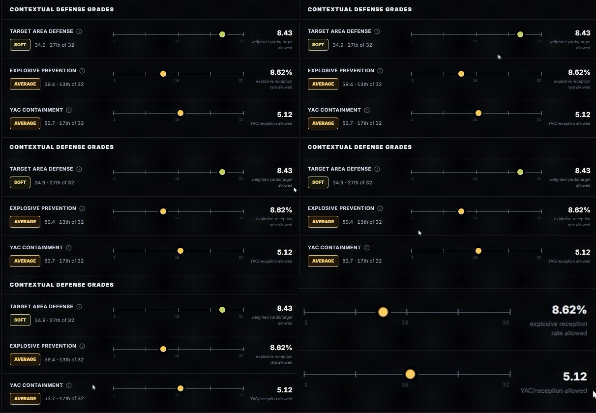
What to notice: A favorable target area profile does not automatically imply easy long receptions or extra yards after the catch. Those are different ways of producing receiving yards, and Statyx gives you separate views of them.
Click the information button beside Target Area Defense to inspect the period, represented targets and qualification. In this example, the evidence drawer shows 122 eligible player targets, all represented by qualified defense grades. That tells you how much of the player's mapped opportunity supports the comparison.
Leave with this: “There is a softer area this receiver actually uses, but the other paths to yardage are not equally favorable.” That is a more useful explanation than “good passing matchup.”
Why the three ranks can disagree
Target Area Defense is contextualized to the areas the receiver uses. Explosive Prevention examines big play resistance; YAC Containment examines production after the catch. Their grades and real unit statistics measure different things. Do not average the three ranks into your own overall score. Use them to identify which part of the receiving profile deserves a closer look.
2. Does the opponent's coverage match the receiver's strengths?
Tool: Coverage Engine
A receiver's best split is not necessarily the split he will encounter most often.
Select a receiver and open Coverage Matrix. Read the opponent's coverage tendency beside the player's production per route, then look at the individual shells. Man/Zone is the first cut, not the end of the investigation.
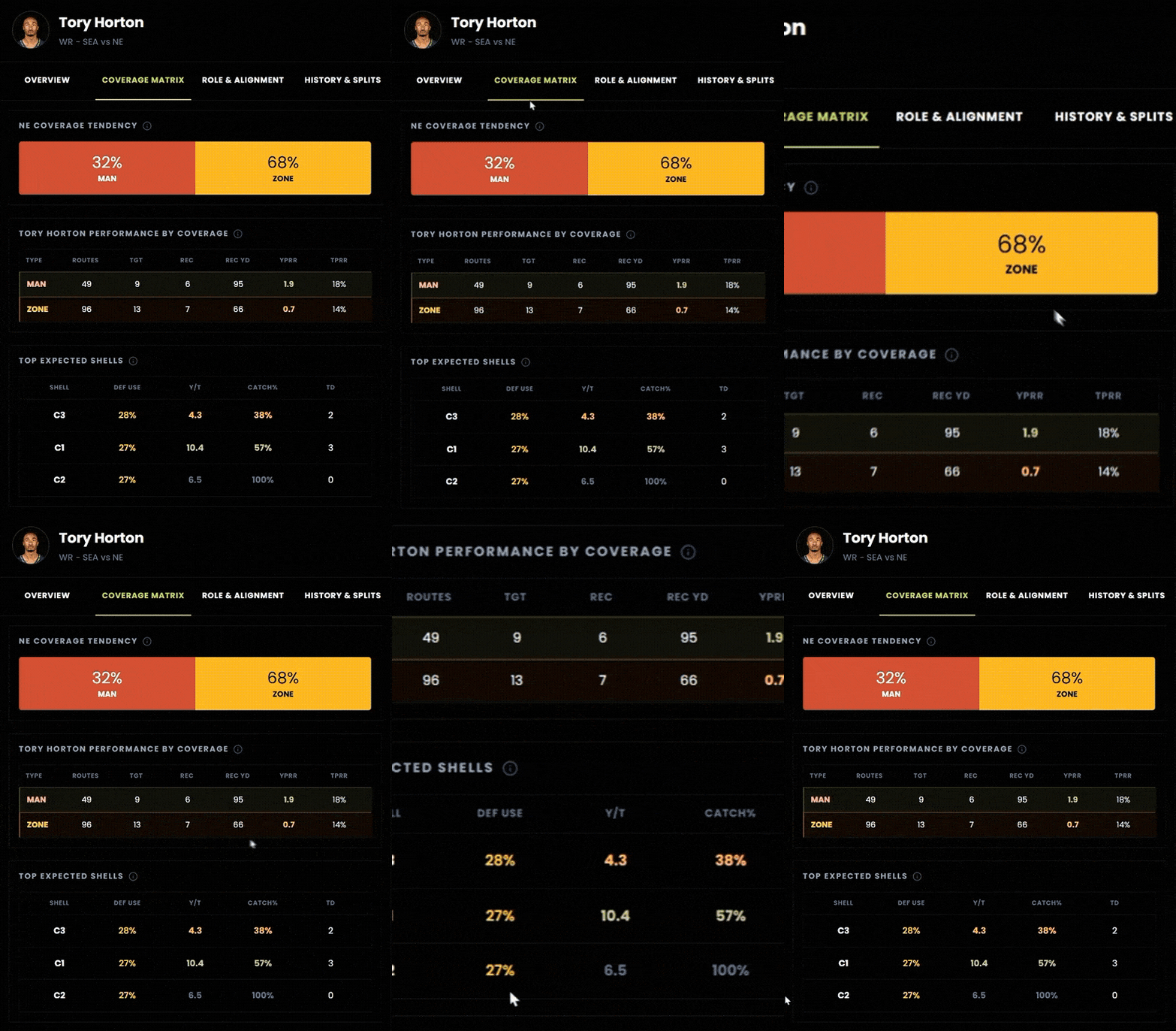
The captured example shows 1.9 yards per route against Man, versus 0.7 against Zone. But the opponent's displayed mix is 68% Zone. The stronger historical split is not the more common defensive look.
Go one level deeper: the C1 row shows 10.4 yards per target, compared with 4.3 against C3. Tempting, but the underlying samples are only 7 and 8 targets, respectively. Those rows generate a research question; they do not settle it.
Try the second test: Open History & Splits, or the production/coverage charts in Overview. Ask whether the better recent games coincided with a different coverage mix. Keep the production metric and time window consistent as you compare.
Leave with this: “His stronger historical split exists, but this opponent leans toward the weaker one, and the shell detail is still a small sample.”
Do not turn the coverage mix into a homemade projection
Multiplying historical Man/Zone efficiency by the opponent's usage percentages can look sophisticated, but it assumes the same role, route volume, opponents and coverage behavior will repeat. The displayed usage is context, not a promised next game mix. Also distinguish YPRR, yards per route run, from Y/T, yards per target: they answer different questions.
3. Is the running back's hot streak a bigger role or better conversion?
A touchdown streak can make a workload look larger than it is.
Open Rush IQ → Weekly Role. Compare Carry Share, Route Share and Goal-Line Share instead of treating “usage” as one number. The weekly table lets you inspect carries, snaps, routes, goal line opportunities and whether the player scored.
In Rhamondre Stevenson's captured 2025 log, Weeks 16 to 18 all show TD: Yes, but carries are 8, 8 and 7. That is a scoring streak; it is not, by itself, evidence of expanding rushing volume.
Next, compare Runner Evidence → Season / Last 3. His displayed 10+ run rate rises from 11.5% for the season to 30.4% over the latest three played games. This points to a second possible explanation: more explosive output from the opportunities he received. It does not establish a new sustainable rate.
Finally, ask whether the opponent's weaknesses overlap with his workload.
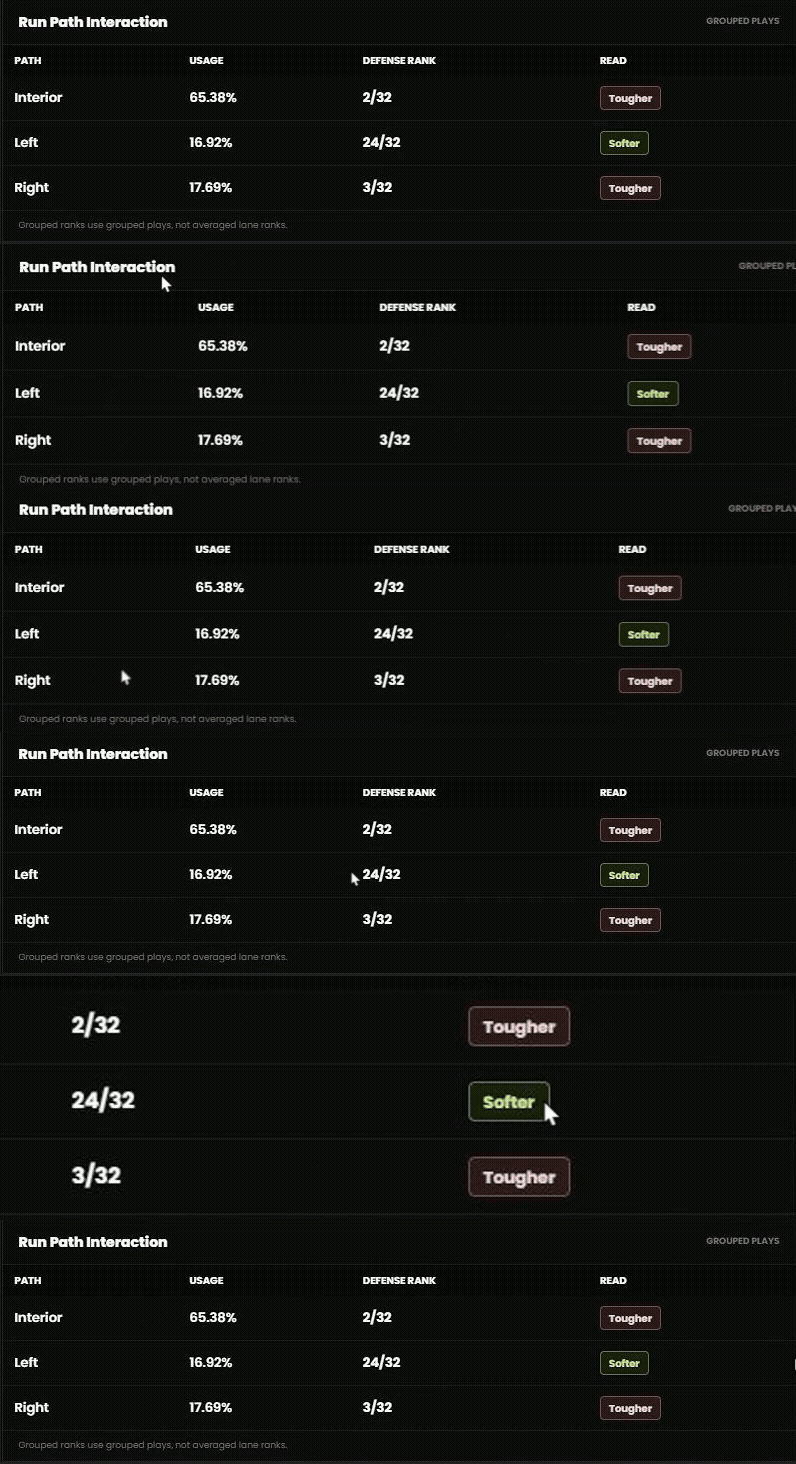
Read the mismatch: The softer left side path accounts for only 16.92% of mapped runs. The interior accounts for 65.38%, against a defense ranked 2nd toughest there. Finding one soft lane is not the same as finding a broadly soft matchup.
Leave with this: “Recent scoring and explosive runs improved, but carry volume did not expand in those three games, and most mapped runs went through the tougher part of this defense.”
Test the mechanism, not just yards per carry
In Overview, use the Player × Defense: SameMetric Check to separate down-to-down success, explosive access, breakaway access, creation and tackle evasion. Then inspect Defense Matchup or Game Log for context. A runner can produce through different mechanisms; one broad run defense ranking cannot explain all of them. Compare like-for-like labels and units, and leave unqualified fields out of the conclusion.
4. Who owns the valuable touches, not just the most touches?
Tool: End Zone
The largest workload and the strongest scoring role are not always the same job.
Select a player, then open TD Opportunity. For a running back, compare the weekly goal line role with three separate questions: how much of the team's scoring opportunity belongs to him, how valuable those opportunities are, and how consistently he receives goal line work.
In Stevenson's 2025 historical detail, Games with GoalLine Work is 9 of 14. That answers frequency across games. It is not the same question as Share of Team TD Chances, which describes a share of modeled opportunity.
|
For a receiver or tight end, follow the receiving path: compare end zone targets with broader red zone involvement. Then use Defense Matchup for that position and scoring path. A defense's RB rushing TD profile is not a substitute for its WR receiving TD profile.
Leave with this: “This player has a meaningful scoring role, but I know whether it is broad, concentrated in a few games, or dependent on a small number of valuable opportunities.”
A large team share can still sit inside a small opportunity pool
Read the player's share alongside Team TD Chances and the team's redzone context. A high share does not tell you how many opportunities the offense creates. Expected touchdowns, or xTD, describe modeled scoring opportunity, not touchdowns owed to a player. Check the historical period and current availability separately before applying the example to a new fixture.
5. What actually changes when a teammate or quarterback changes?
Tools: Camp Wire, Depth Chart, Prop Detailer and Route IQ
“A teammate is out, so this player gets more work” skips the part you need to investigate.
Use Camp Wire to establish what was reported and when. Then use Depth Chart to inspect the relevant personnel package, not just the next name in a position list. A role in an 11 personnel formation need not be the same role in a two tight end package.
In Prop Detailer → Player Props, use With/Without to compare the available historical games with the relevant teammate present and absent. Keep the statistic, line and venue setting fixed, and note the remaining game count. Change one condition at a time.
For a quarterback change, go to Route IQ → QB Impact → Quarterback relationship. That selector separates historical player QB pairings instead of blending them into one receiver average.
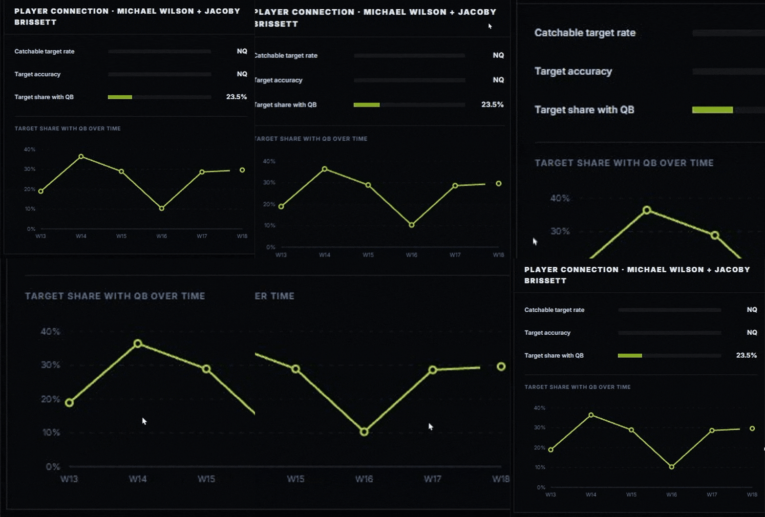
What to test: Did his share of targets change with that quarterback? Did the passing environment change too? Read the pair-specific share alongside the quarterback's EPA/dropback, CPOE and aDOT context. That separates distribution of opportunity from the environment in which it arrived.
Leave with this: “There is evidence this player's involvement differed under that personnel setup.” Not: “The absence caused the change” or “the old relationship guarantees the next one.”
Look for a role change before the box score catches up
In Route IQ → Weekly Growth, compare Target share, TPRR and Route participation where qualified. Participation asks whether he is running more routes; TPRR asks whether those routes are drawing targets. They can move differently. Use Alignment for wide/slot/inline/backfield changes only when that player's panel has valid evidence. Missing alignment is not evidence that his role stayed unchanged.
6. Can you turn your research into a chart worth sharing?
Tool: Data Lab
A leaderboard answers “who is highest?” Data Lab → Create Charts lets you ask a second question visually: are those players getting there in the same way?
Try this: Which quarterbacks combine passing workload with efficiency? We created the example below in Statyx's chart studio, using its live Data Lab query, not an externally designed mockup.
- In Data Lab, choose QB, 2025 and Season, then open Create Charts. Define the evidence period and intended minimum workload before selecting your favorites.
- Choose Four-quadrant scatter. Set X metric → Dropbacks and Y metric → EPA/DB. Right means more passing workload; up means more expected points added per dropback in this historical sample.
- Select the quarterbacks you want to compare. The studio supports up to 10 selected rows and 3 highlights. Our example uses Maye, Stafford, Love, Allen and Mahomes, with Maye highlighted.
- Choose a canvas, write a title that states the question, and put the season and comparison group in the subtitle. Use names and teams so the graphic can stand on its own.
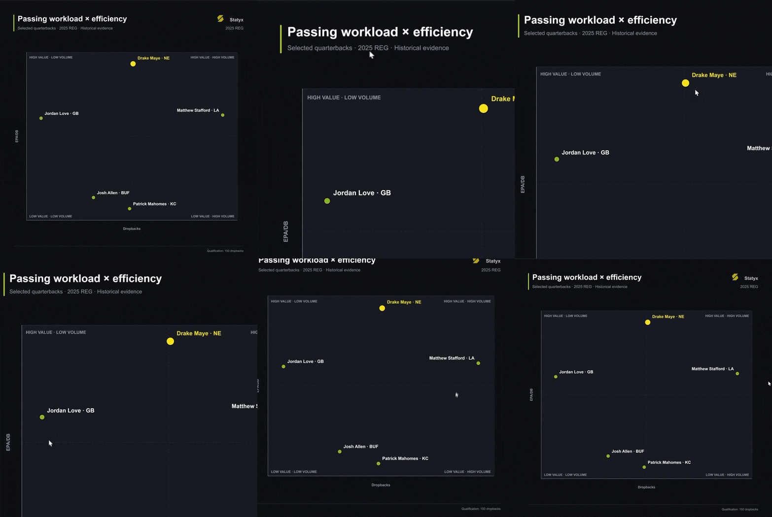
Read the separation: Stafford sits farther right than Maye, while Maye sits higher. In this comparison, greater passing volume and greater efficiency are not the same distinction. That insight is harder to see when you sort a table by only one column.
The studio also provides Ranked bars, Scatter, Weekly trend, Percentile profile, Multimetric heatmap, Player comparison and Rank movement. Use a trend for change over time, a scatter for the relationship between two measures, and a profile or heatmap for multiple dimensions. Choose a template that answers the question, not simply the busiest graphic.
Presentation controls include X 1600 × 900, Square 1080 × 1080, Portrait 1080 × 1350 and Article 1920 × 1080, plus names, teams, values, ranks and percentiles. PNG, JPEG and Copy link controls are available in the studio; check the resulting image or link before distributing it.
Leave with this: A graphic that explains one defensible finding with its cohort, period and metric labels intact. Research becomes something you can communicate, not just something you can scroll through.
Build a better query before building the chart
For receiving research, select WR and use Columns to compare Games, Targets, Target Share, AirYards Share and Yds/Target. Target share and air yards share distinguish opportunity profiles; yards per target describes their conversion. More filters → Situation includes early downs, third down, red zone, neutral script, leading and trailing. Confirm that your resulting cohort and fields support the question. Preserve table settings with Save view, or use CSV for further analysis. A polished chart cannot rescue an inconsistent comparison.
7. Why are two fantasy projections similar if the players' roles are different?
Tools: Fantasy Board + Coaching DNA
Similar projected points can conceal very different dependencies.
Start in Fantasy Board with the same week and scoring format. Compare projected points with Floor, Ceiling and TD%. Then change PPR/Half PPR/Standard to investigate how reception scoring affects the comparison. The board's TD% refers to rushing or receiving touchdowns; it excludes passing touchdowns.
Now open Coaching DNA for the offense. Game Plan supplies modeled play volume and pass rate context; Expected Looks explores projected target allocation. Ask whether your player's opportunity depends on a large passing workload, a concentrated share, or a particular distribution among receivers, tight ends and running backs.
Bring that explanation back to observed role in Route IQ, Rush IQ or End Zone. You are checking the assumptions beneath the fantasy total, not stacking several forecasts and calling that independent confirmation.
Leave with this: “These totals are close, but one profile depends more on receptions and the other on scoring opportunity.” That tells you what to monitor as news and roles change.
Keep estimates separate from observations
Coaching DNA and Fantasy Board include modeled outputs. Read their update timestamps and selected periods; a new fixture label does not make every input current. Floor and ceiling are estimates, not hard bounds, and should not be described as a particular confidence interval unless the tool defines one. Use the modeled views to form questions, then test them against historical evidence.
8. Does the quarterback attack the defense's actual weak spots?
Tools: Coaching DNA → QB Field Profile + Route IQ
“This defense struggles against quarterbacks” still leaves a football question unanswered: does this quarterback throw where it struggles?
Open a matchup in Coaching DNA, then select QB Field Profile. The field splits passing into five depth bands and three lateral lanes. Read it in three passes: Distribution for where throws go, Accuracy for completion performance relative to expectation, and Efficiency for the value produced.
Start with the busy areas. Short-left accounts for 22.4% of Maye's mapped throws, from 110 attempts. Very-deep-middle accounts for 0.8%, from only 4 attempts. A striking defensive value in that tiny use zone should not drive the whole matchup story.
Select the Short-left cell. Its detail shows 78.2% completion, 68.8% expected completion, +6.6 percentage points CPOE (shrunk) and 0.335 EPA per attempt. These are different lenses: frequency, difficulty-adjusted accuracy and efficiency. The displayed shrunk CPOE is not simply the subtraction of those two completion percentages.
Now switch on SEA allowed. The teal defensive overlay is CPOE allowed: positive means completions occurred more often than expected in that zone. Compare it with where the quarterback actually throws, and inspect samples rather than treating every colored cell as equally persuasive.
Try the advanced test: Change Season → Last 4 / Last 8, then compare All with Neutral, Trailing, Leading or Two minute. Change one setting at a time and check the remaining sample. Is the apparent preference part of his broader profile, or concentrated in a particular game state?
Finally, use Route IQ to ask which receiver's target geography overlaps those areas. The quarterback's throw map and the receiver's target map have different denominators: use them as connected evidence, not interchangeable percentages or proof of the next game plan.
Leave with this: “I know where this quarterback directs meaningful volume, how he performs there, and whether the opponent comparison supports that same route to production.” That is the step a single positional rank cannot perform for you.
Read a field profile as zones, not tracking coordinates
Depth is target air yards; lanes are recorded left, middle or right. These are grouped zones, not exact throw locations or route paths. CPOE means completion percentage over expected; EPA means expected points added. Check the selected season, fallback notice and sample after every filter change. An extreme defensive value without enough supporting evidence is a reason to inspect further, not a reason to become more certain.
Finish with an explanation you can defend
You do not need ten tabs open. You need a short chain of evidence.
My question → the observed role → the relevant opponent mechanism → the countersignal → what would change my view.
Start with one player. Choose one of the eight questions above. Inspect the panel that could change your first impression, and write the answer in two sentences. If a visual makes it clearer, carry the comparison into Data Lab's chart studio.
That is how Statyx becomes more than another screen of stats: the result is no longer the end of your research. It is the beginning of an explanation.
Open Statyx NFL and try your first investigation.
Quick answers and evidence notes
Which tool first? Use Prop Detailer for game-level outcomes, Data Lab for discovery, Route IQ for receiving geography and QB relationships, Coverage Engine for defensive looks, Rush IQ for rushing mechanisms, and End Zone for scoring role. Camp Wire and Depth Chart establish personnel context; Fantasy Board and Coaching DNA add explicitly modeled views.
What does NQ mean? The displayed comparison is not qualified. It is not a zero and not a judgment of the player's ability. Other fields in the same tool can still contain useful evidence.
Is this better than a DvP ranking? For explaining how a specific player's role interacts with an opponent, it provides dimensions that a positional rank alone cannot show. That is a claim about analytical detail, not proven prediction accuracy or a claim that every other site lacks advanced tools.
Are the examples current forecasts? No. These are dated product demonstrations using the evidence periods in the captions. Historical teams, personnel and selected fixture labels are context, not confirmation of a current roster or upcoming schedule. Images are focused captures of authentic Statyx UI or the native Data Lab chart; none is a regenerated interface.
Published for research and entertainment purposes. Not betting advice.


Discussion
Sign in to join the discussion.
Loading comments…